As you have probably noticed, the past few years in design have been dominated by bold colors, mind-bending gradients, and futuristic compositions.
But in 2020, the graphic design world is going to feel a lot more reserved, harmonious, and natural.
Well, except for the illustrations, those are going to get a lot more abstract this year.
Design styles that were very unique just a few years ago have become just another common tactic used by massive corporations.
This shift is likely a reaction to the overuse of some of the previous graphic design trends.
1. Muted Color Palettes
Over the past few years, we have seen the rise of bold colors in design, as brands looked to differentiate themselves from competitors. With bright blues, electric yellows, and toxic greens appearing all over the yearly graphic design trends.
But in 2020, we are going to see designers and brands take a step back from those vivid colors towards more muted color palettes.
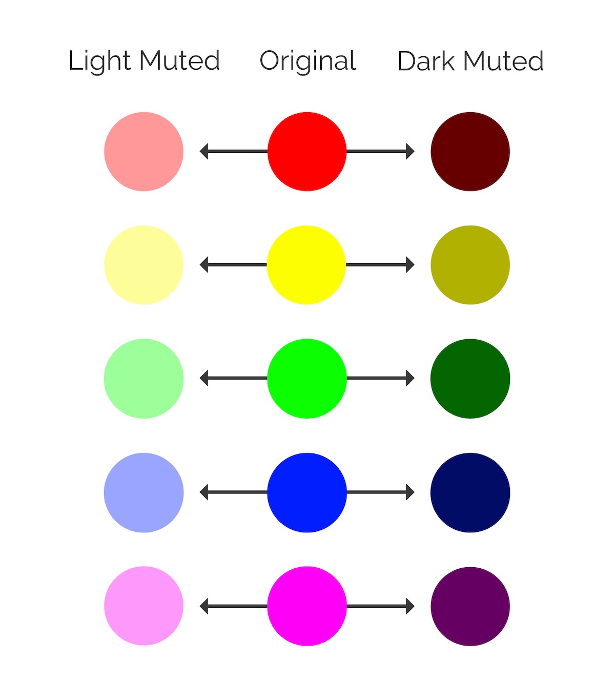
Muted colors have been slightly desaturated with black, white or a complementary color. They are basically the opposite of vivid colors.
As you can see below, the LinkedIn Marketing team have been using these muted colors like a pro lately:

Presidential candidate and South Bend Mayor Pete Buttigieg even selected muted colors for all of his campaign and branding:

In each of the examples above, there’s still a lot of brand colors being used, but if they would have used vivid colors the images would be a lot more abrasive.
Now don’t worry, the design world isn’t going to get less colorful this year. The colors might just be a little more reserved across the board.

I like to think of muted colors as vivid colors that have had their “edge” taken off with an infusion of black or white. The chart below is a good example of both light and dark muted colors actually:

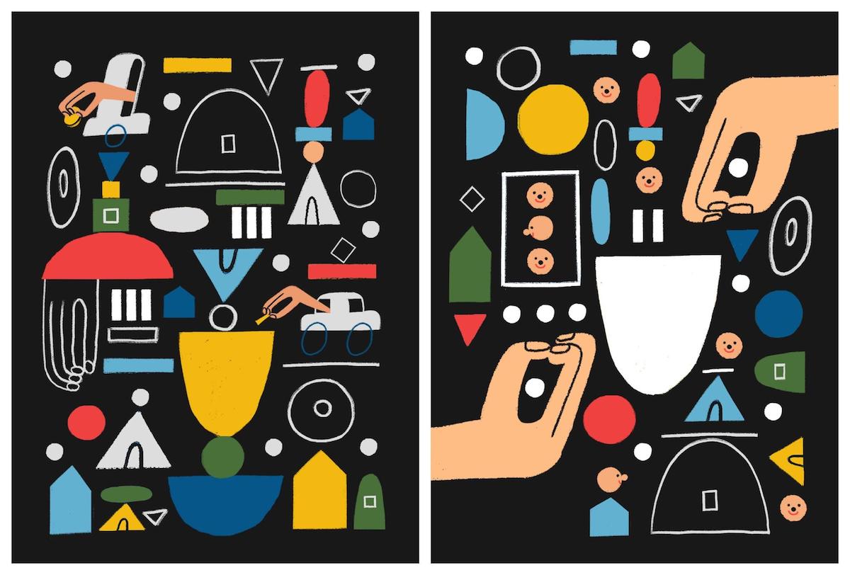
Because of that infusion, muted colors work almost flawlessly with neutral colors. In this example, the black background and the multiple muted colors blend almost perfectly on these charity fundraising posters: